New visual identification of Sopot. Here, time passes at your pace
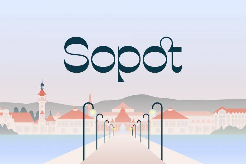
The city of Sopot has a new visual identification. The new logo, typeface and graphic design, inspired by Sopot details and colors, were created in cooperation with the Podpunkt graphic studio.
– We present to you a new sign of Sopot, which is an element of an extensive system of visual identification of the city and its units – says Magdalena Czarzyńska-Jachim, mayor of Sopot. – The new logo reflects the identity of Sopot and tells about its history in a way that combines the tradition of the resort with the challenges and needs of a modern city.
The yellow and blue sign that the City has used since 2004 no longer meets the needs of modern communication. Graphic trends have changed over the past 20 years, and the developing Sopot needs a sign that will combine historical values with the current strategy.
The new sign is based on letters. It was created with a specially designed typeface. It fits well both in digital media and in traditional forms, e.g. newspapers. The logo emphasizes the uniqueness of the city and ensures its recognition. It talks about the values of Sopot, its universal symbols and distinctive advantages. The structure of the sign includes, among others: delicate arcs of sea waves, seagull wings, bends of lanterns on the pier or eclectic decorations of Sopot villas.
The new visual identification of Sopot is much more than a refreshed graphic design. At the same time, it is a system that will organize communication with residents thanks to consistent marking of municipal institutions and units, which will now be under one "Sopot umbrella". All logos are based on the same typeface and colors, maintaining the distinct character of each institution. Thanks to the introduction of a new logo, new visual identification and the entire family of signs of city units and institutions, residents will gain a modern, legible, aesthetic sign that strengthens the city's brand and builds a coherent message. They will have a guarantee that all messages come from a reliable, safe source and provide verified information.
The new promotional sign was created thanks to cooperation with the Podpunkt graphic studio, which has many years of experience in designing logos for cities, universities and cultural institutions.
Więcej informacji: https://www.sopot.pl/aktualnosc/12858/nowa-identyfikacja-wizualna-sopotu-nowoczesnosc-spotyka-sie-z-tradycja
Press pack: https://www.swisstransfer.com/d/89ddcf71-47c0-4588-9c24-0c7d7709c06a